SimplyPut was founded on the premise of making data answers to business questions accessible to anyone without the need of data analysts or lengthy data request queues through conversational AI data analytics. With SimplyPut connected to your data warehouse anyone can ask a question in natural language and get a reliable answer instantly.
We’ve always provided common data visualizations to compliment many answers through bar charts and graphs, but through the ubiquity of SimplyPut across organizations we found our customers requesting additional visualization types to meet their diverse data needs. That is why we are so excited to announce that all users can now access 21+ new charts and diagrams in addition to the previously supported data visualizations.
Now whenever you ask a question in SimplyPut you can also ask it to display the response in any of these data visualizations to bring additional perspectives to the answer instantly. Any chart, graph, or diagram can be downloaded and inserted into presentations or documents.
Here is list of some of the most exciting new charts and diagrams now supported in SimplyPut and how they can be used to enhance your data:
Flowchart: A flowchart is a graphical representation of a process, showing steps and decision points using symbols like arrows, rectangles, and diamonds. Businesses use flowcharts to visualize workflows, simplify complex processes, and identify inefficiencies.
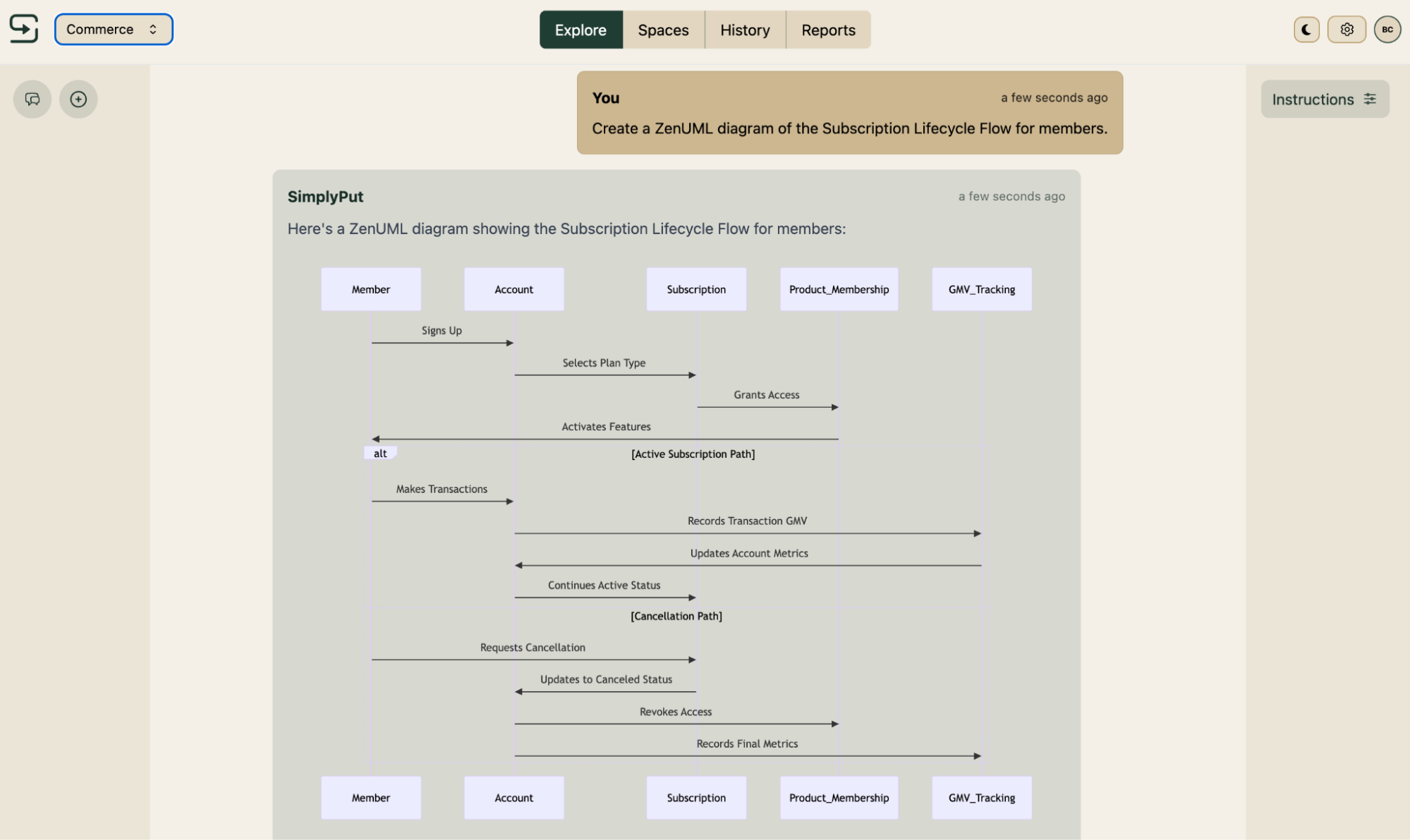
Sequence Diagram: A sequence diagram illustrates the flow of messages or interactions between objects or systems in a defined order. It is commonly used in software development to model system behaviors or use cases.
Class Diagram: Class diagrams depict the structure of a system by showing its classes, attributes, methods, and relationships. They are essential in object-oriented programming to design and organize software architectures.
State Diagram: State diagrams represent the states of an object or system and the transitions between them based on events. Businesses use these diagrams to model dynamic behavior and system states for product or system development.
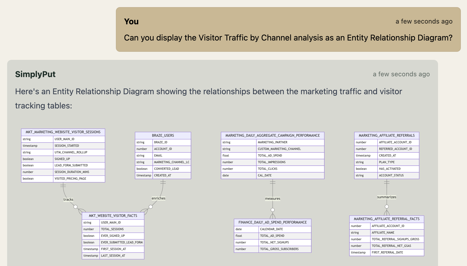
Entity Relationship Diagram (ERD): An ERD maps entities, attributes, and relationships in a database system, showcasing how data is structured. It is a crucial tool in database design and ensuring proper data relationships in business applications.
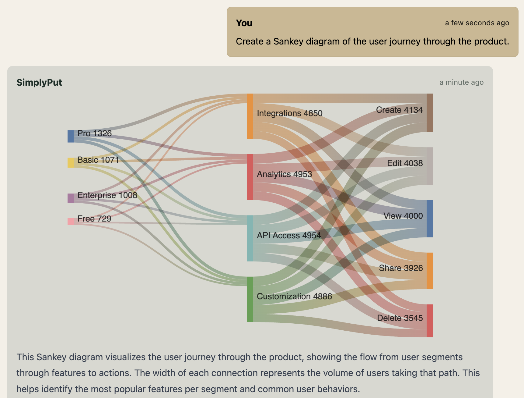
User Journey: A user journey visualizes the steps a user takes to achieve a goal, from initial engagement to completion. Businesses use these diagrams to enhance customer experiences and improve product design.
Gantt Chart: A Gantt chart is a bar chart that represents a project schedule, showing task durations, dependencies, and progress. It helps businesses plan, track, and manage projects effectively.
Pie Chart: A pie chart is a circular graph that divides data into proportional segments, representing parts of a whole. Businesses use pie charts for clear and simple representation of percentage distributions.
Quadrant Chart: Quadrant charts divide data into four sections based on two axes, helping categorize and analyze data. Businesses use them for strategic planning, market segmentation, or prioritization.
Requirement Diagram: A requirement diagram outlines system or project requirements and their relationships with other elements. It aids in understanding and tracking requirements during development processes.
Gitgraph (Git) Diagram: A Gitgraph diagram visualizes the branching and merging structure of a Git repository. Businesses use it to manage and document version control in software development projects.
C4 Diagram: C4 diagrams break down software systems into layers, illustrating context, containers, components, and code. They help developers and stakeholders understand the architecture of a software system.
Mindmaps: Mindmaps are hierarchical diagrams used to brainstorm and organize ideas, with a central node branching into related topics. Businesses use them for idea generation, planning, and knowledge management.
Timeline: A timeline represents events or milestones in chronological order, often as a linear chart. Businesses use timelines to visualize project schedules, historical trends, or strategic plans.
ZenUML: ZenUML is a textual tool for generating sequence diagrams that emphasize simplicity and clarity. Businesses use it to model interactions quickly in software or system design.
Sankey Diagram: A Sankey diagram displays the flow of quantities through a system, emphasizing proportional distribution. Businesses use it for energy, material, or resource flow analysis.
XY Chart: An XY chart, also known as a scatter plot, shows relationships between two numerical variables. Businesses use it to identify trends, correlations, or clusters in data.
Block Diagram: A block diagram represents a system's components or functions in a high-level, simplified form. Businesses use them for system design, troubleshooting, and process visualization.
Packet Diagram: A packet diagram visualizes the flow of data packets in a network, highlighting protocols and paths. Businesses use it to understand and optimize network performance and security.
Kanban Diagram: A Kanban diagram is a visual board showing tasks organized by their status, such as "To Do," "In Progress," and "Done." It helps businesses manage workflows and improve task tracking in projects.
Architecture Diagram: Architecture diagrams illustrate the structure and interactions of system components at a high level. Businesses use them to communicate and document the design of IT or organizational systems.
Ready to harness the power of AI data analytics to see your business in a whole new way? Sign up today for a free trial or let us know if you’d like a personalized demo.
Stephen is a SimplyPut Co-Founder and former data scientist and analytics manager at Atlassian. He is passionate about all things data and excited to be working on SimplyPut to enable everyone to answer their data questions.